
How to Make a Line Chart that Doesn't Lie
Rule 1: Include a properly scaled y-axis.
This seems like it should be easy, yet the people at Americans United for Life (AUL) did not follow this simple rule when creating the chart below. This chart was shown briefly during a House government oversight committee on September 29th in which Cecile Richards, president of Planned Parenthood, was questioned by House Republicans.
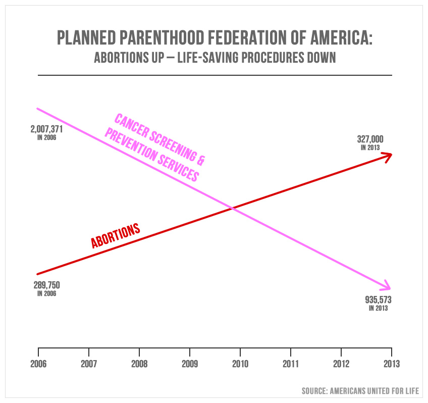
AUL defended their chart in a barely readable blog post.
“...activist media sites exploded in a furry [sic] of smoke and mirrors, trying to critique the visual rather than discuss the mathematical reality behind it.”
Let’s be clear, there is NO mathematical reality in AUL’s chart. The chart is a lie.
I was able to track down the annual reports published by Planned Parenthood for all years from 2006 to 2013 except for 2008. While the annotated numbers AUL uses are true, the two lines are false, they should not cross one another. The number of abortions performed by Planned Parenthood is less than the number of cancer screenings, and has been for the entire time period from 2006 to 2013. In mathematical reality, 327,000 is less than 935,573.
Planned Parenthood’s annual reports also contain figures on other services they provide, such as STI / STD screenings & treatment, contraceptive services, and pregnancy & prenatal services. I made a new chart from this data and included all of the different types of services performed by Planned Parenthood.
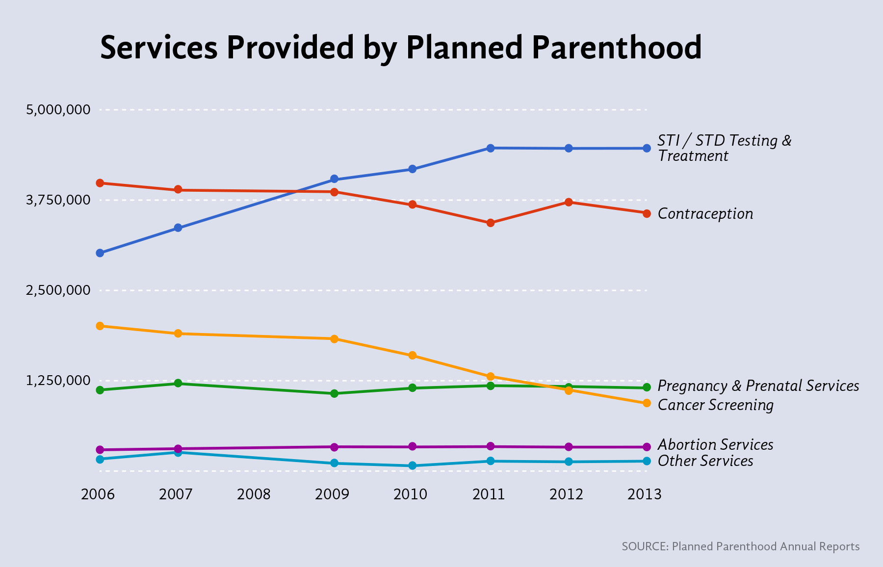
When these numbers are plotted with an honest-to-goodness common y-scale, the number of abortions appears nearly flat. There is, however, a decline in cancer screenings starting in 2009. At first I wondered if this might be due to the Affordable Care Act. Are people visiting PP less often for this service because more have health insurance and can see their private doctor? But this didn’t make much sense, since the ACA only took effect in 2013. Why did the number of cancer screenings start declining in 2009?
I posted a version of this chart on twitter and someone posited a plausible answer. National guidelines for the frequency of cervical cancer screenings were officially changed in 2012, but the American College of Obstetricians and Gynecologists started advising a reduction of frequency in 2009. Previously, women received a pap smear to screen for cervical cancer once a year, but it is now recommended that pap smears should be performed every three years.
In addition, changes in recommendations were made in 2009 regarding how early and often women should begin receiving regular mammograms. The recommended age to start breast cancer screenings went from 40 to 50 years of age for healthy women, and should occur less frequently, once every two years rather than every year, according to these guidelines.
It turns out that properly plotting your data is a great way to find out what’s really going on.
It’s also worth mentioning that the vast majority of services provided by Planned Parenthood are not related to abortion. The most common services provided by Planned Parenthood during this time period were STI / STD testing & treatment, and contraception services. In 2013, Planned Parenthood provided nearly 4.5 million services related to STI / STD testing & treatment, and over 3.5 million contraception services. Providing people with affordable access to contraception seems like a great way to prevent unwanted pregnancies and possibly prevent someone from seeking an abortion in the first place.
Full Disclosure:
The chart shown here is an update from one I originally posted on twitter. I made the following changes from the original:
- I deleted the subtitle, “People served from 2006 to 2013”. This chart is not showing number of people, but the number of times a service was provided.
- I added dots to the data points. I was unable to find the 2008 Planned Parenthood annual report and do not want to imply that 2008 data is included.
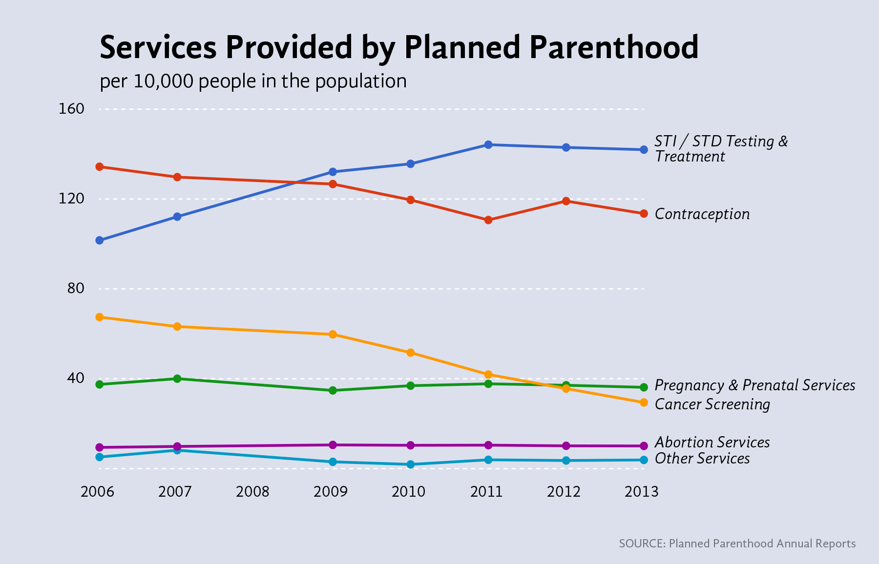
It was also suggested on twitter that the data should be normalized for population. I did this, finding the number of times a service was performed per 10,000 people in the population, and the chart is nearly identical.
The data used and links to original sources are available here.